"The new Slack logo sucks" ; Why your opinion should be smarter
Everytime there’s a redesign somewhere of some logo, or a ‘rebrand’ of a famous company, we see a wave of hate it/love it comments.
Of course, everyone has the right to like or dislike a new logo, but we should consider the thought proces and work behind it as designers. Even if 80% of all the people HATE the new logo, they actually do not know the underlying reasons why a company decided to rebrand and invest a lot of money. As a logo designer and strategist myself I love to evaluate things from a broader perspective and reverse engineer a new logo redesign or rebrand.
The new and old F1 logo
The new slack logo
Let’s take a look at a recent logo stampede: the F1 logo redesign.
Immediately a lot of people started bashing on the design; “They are destroying the legacy”, “The new logo is made in 2 steps”, “It’s ugly and fat”,.. A lot of people are questioning the company and the designers or agency who did it. I get it, it’s a logo that carries a lot of emotional bagage, it’s a logo with a great legacy. In that perspective, it’s amazing to see how much engagement there is, maybe doing a rebrand is a good ‘finger in the water’ as to how envolved your audience is (this is worst reason to do a rebrand actually).
Admitted, the memes are funny sometimes
Or remember other recent rebrands like ebay, dropbox, kickstarter and science museum?
Whenever one of these redesigns pops up, there is often a storm of critique and laughter. Of course that is also a good thing, it shows people are involved with the brand. If you look at new logo’s for fresh brands, they are often met with a lot of praising and halleluja comments, but redesigns not so much.
Are these logo redesigners always stupid monkeys? Are the companies choosing for a rebrand just corporate idiots being disconnected from their audiences? Maybe so, or maybe there is more to it.
Before you get out the hammer, consider:
1. There’s a thing called brand strategy
It defines the logo design proces more than just ‘visual decisions’ alone. The decisions made in this well thought out process can sometimes take months and are based on research, strategic thinking and frameworks. You may not ‘see’ this in the logo design, but it’s there, it works on the long run.
A rebrand is done for several reasons:
To grow their audience. To adress a new audience. To better reflect the current company/culture vision. To adapt better to the changed media and culture, .. So many reasons that have a clear business goal behind them and usually even a clear set of defined goals (increase in x-audience in year …). Once this strategy is decided there is a bridge made to the visual part of logo design, this is often the hardest part, filling in this gap with a visual device that will carry the strategy forward.
But… the logo is not the strategy!
It’s just a small part of it, the tip of the iceberg if you will. For the F1 rebrand, they did thorough user research: “The project initially involved an in-depth research campaign that sought the opinion of F1 fans across the world. Turley says the results indicated that some had become disengaged with the sport and felt its glory days were behind it. There was also the understanding that the “engineering” side of F1 had perhaps overtaken its personality-driven “human” side; that the stories of the drivers had been eclipsed by the cars they were driving.”
Read more about the F1 rebrand here
So consider the strategy part before you judge to logo, what does the new logo say, how is it different than the one before and what does that inform? Often times when you get to know the strategy behind, you get a lot more ‘sense’ of the choices made in the visual proces. You can start to apreciate the changes made. Creating a rebrand is a big problem to solve, and there are a lot more things to consider below the surface than the logo.
Another great example of a well informed strategy is the one for Dropbox by design studio Collins:
“The brand has been repositioned as a place “where in-progress work happens as opposed to old finished project storage”. In the illustrations, this manifests as a “sketchy”, pencil-drawn style of illustration to maintain a raw feel, that also contrasts the block colours and shapes of the wider branding.”
Suddenly, the crazy illustrations do not seem so ‘random’ anymore, there is a reason to the esthetics. But I must admit, that brownish/pink combo looks ugly as f*ck. Read more about the dropbox rebrand here.
2. It’s not about ‘how fast you can make it’
A lot of negative feedback is about how ‘fast’ you can re-create it. It’s not about that. A logo can be as simple as a circle or a dot, or a swoosh. The value of the logo is not about how long it took you to re-create it, it’s about how memorable it is, how well it works on all sizes, how it can work as an identity.
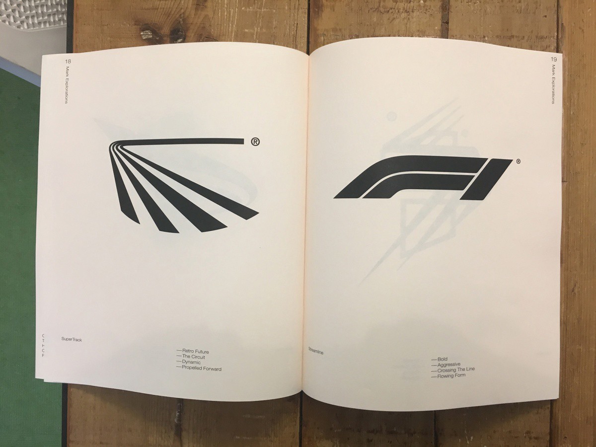
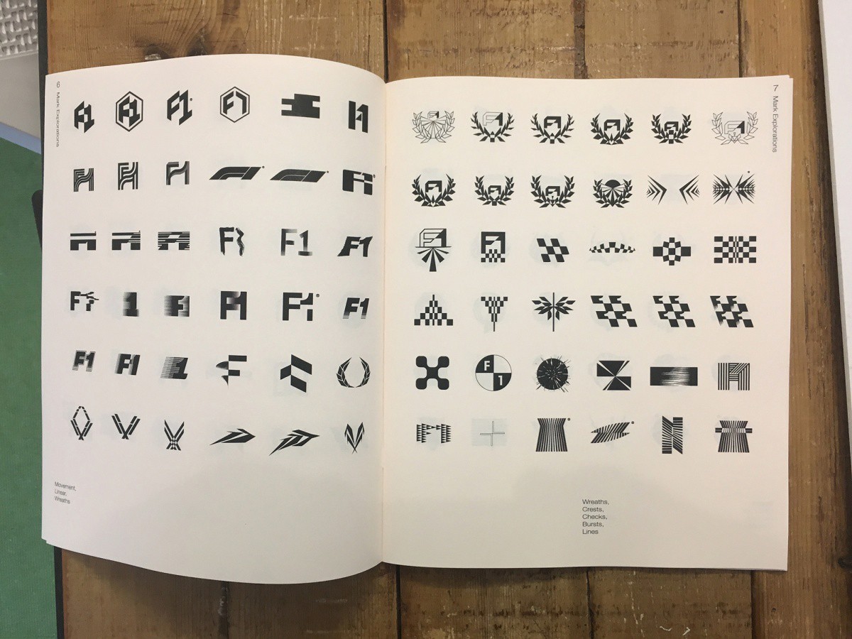
Another thing to consider is this: usually these redesigns take months, lots of iterations and a well thought out strategy, so the thing you and make fun of, is the thing that got out of a long proces of iterations, feedback and craftmanship. Take a look at the design process for the F1 logo for example, they did so many directions and options.
The many iterations and directions for the final logo for F1.
3. Look beyond the logo, how does the complete identity work?
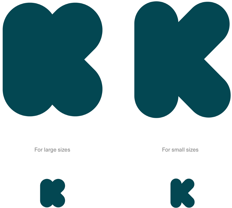
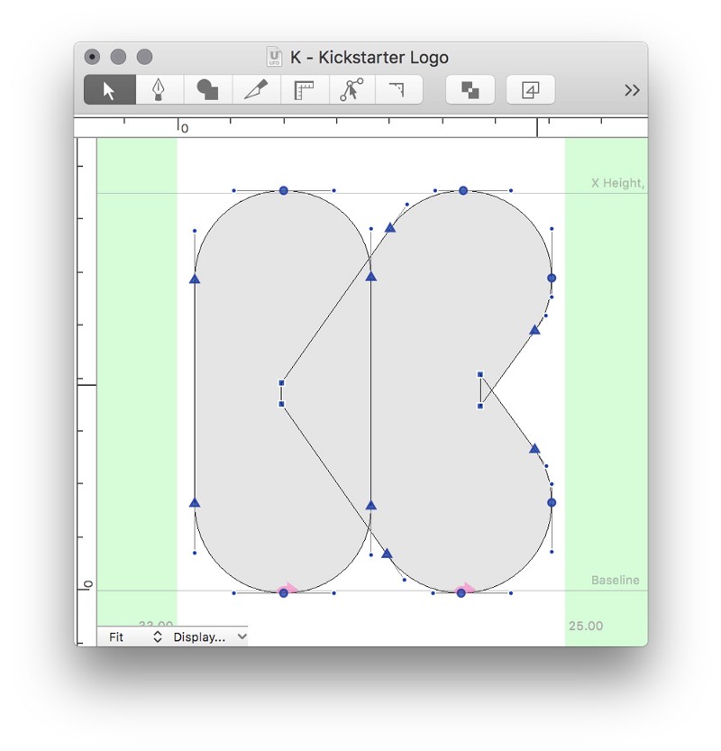
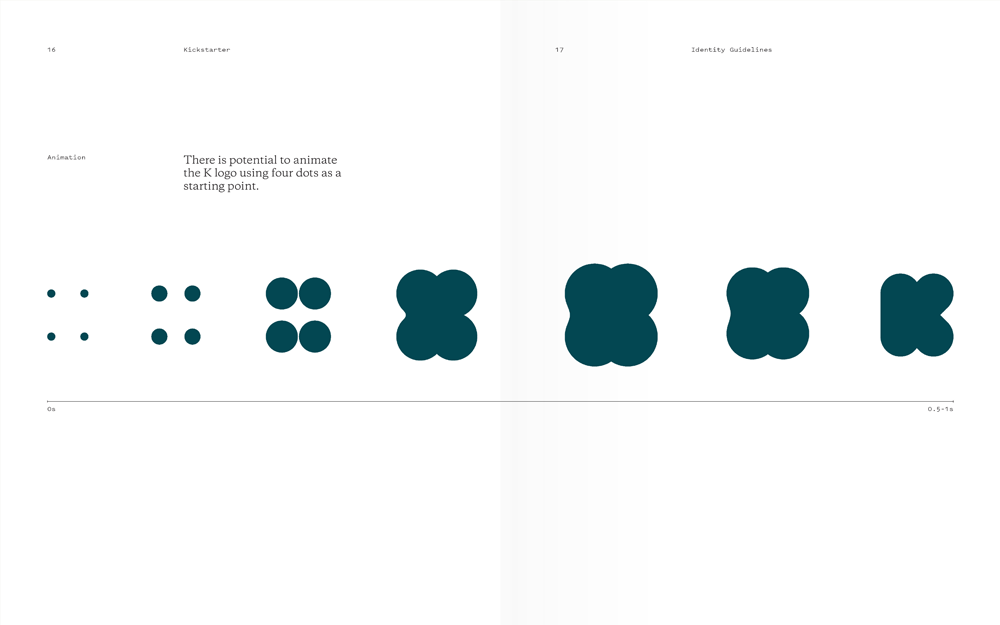
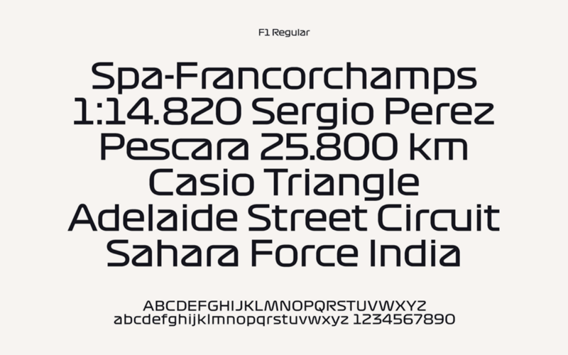
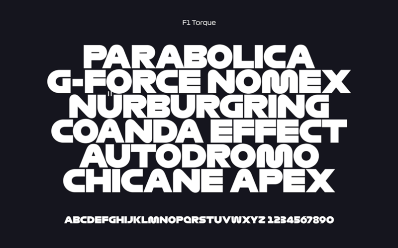
Most rebrands come with a new identity system, often times there has been put so much effort and craftmanschip into these identity systems. Take for example the ‘bloated’ kickstarter logo, or the custom fonts they created to pair up with the new F1 mark, this is not just an accidental ‘stroke offset’ in illustrator, these are well thought out systems that are set to work on different media.
The kickstarter ‘monogram’ K as the icon, also the thought process of how to animate the kickstarter K from simple dots.
I love how all the elements come together in this rebrand for the F1 logo, a beautiful custom set of typefaces, bold colors and a strong mark make for a memorable logo.
4. A rebrand is in it for the long game
A brand strategy, a corporate identity, these are not one-month advertising campaigns, these are things build to last years. Not only that, they are meant to evolve, to interact with their communities and grow. Only after a few years can we actually really judge the failing/succes of a logo redesign, only then can we see if the brand is ‘working’.
So, I hope the next time you see a logo rebrand, you don’t immeadiatly jump on the hate train, but consider the process behind, consider the passionate design teams and business leaders making these decisions.
And sure, make some memes, it’s funny af.


